Organizing Data Pipelines with Groups
Enhancing Data Quality (DQ) Pipelines: Expanding user control over complex enterprise data pipelines with Groups
My Role
Led end-to-end design from concept to handoff:
- Research and Analysis
- UX Design
- Visual Design
- Testing and Dev Handoff
Team
- 1 UX Designer
- 1 Product Owner
- 5 Developers
- 1 Info Developer
Timeline
3 months
What is Data Quality? And who is using it?
Data Quality (DQ) is a complex tool that deals with millions of rows of data. This data decides, for eg, where the business allocates their money for the year. So this data has to be absolutely clean and accurate.
DQ users are the people in-charge of cleaning said data by building pipelines. They can be technical or non-technical folks who add “steps” (processes) in a pipeline to get accurate data.
But DQ Users are struggling...
For example, a “remove spaces” step would eliminate spaces from the selected items. Pretty simple… right?
Well, real world data is convoluted. Even such simple steps have to be repeated several times over which creates long and unmanageable pipelines.

Difficult to scroll, locate a specific step. Builds frustration and a sense of clutter.
How can we make pipelines manageable and efficient for our users?
Insights and Design Goals
Understanding our competitors and user pain points.
Preliminary competitor analysis showed that most apps used simple containers, visual collections, or tags to manage pipelines.
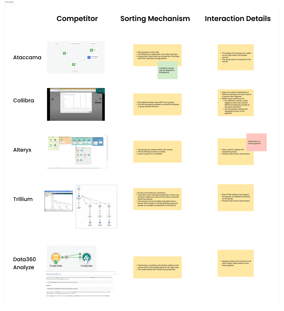
After discussions with PMs, engineers, and UX architects, I explored adding configurations to the simple containers that other apps used.
This was an opportunity to make DQ pipelines manageable and more efficient. So with this approach, I introduced groups to DQ pipelines.
Empowering users to organize their pipelines and reduce repetition.
With insights from the competitor analysis and feedback from SMEs and my team, I broadly marked the design goals for the feature.
Design Goals
Groups
To organize steps the way it makes sense for users and shorten pipelines.
Filters
To reduce repetition so users don't have to sieve through their data at each step.
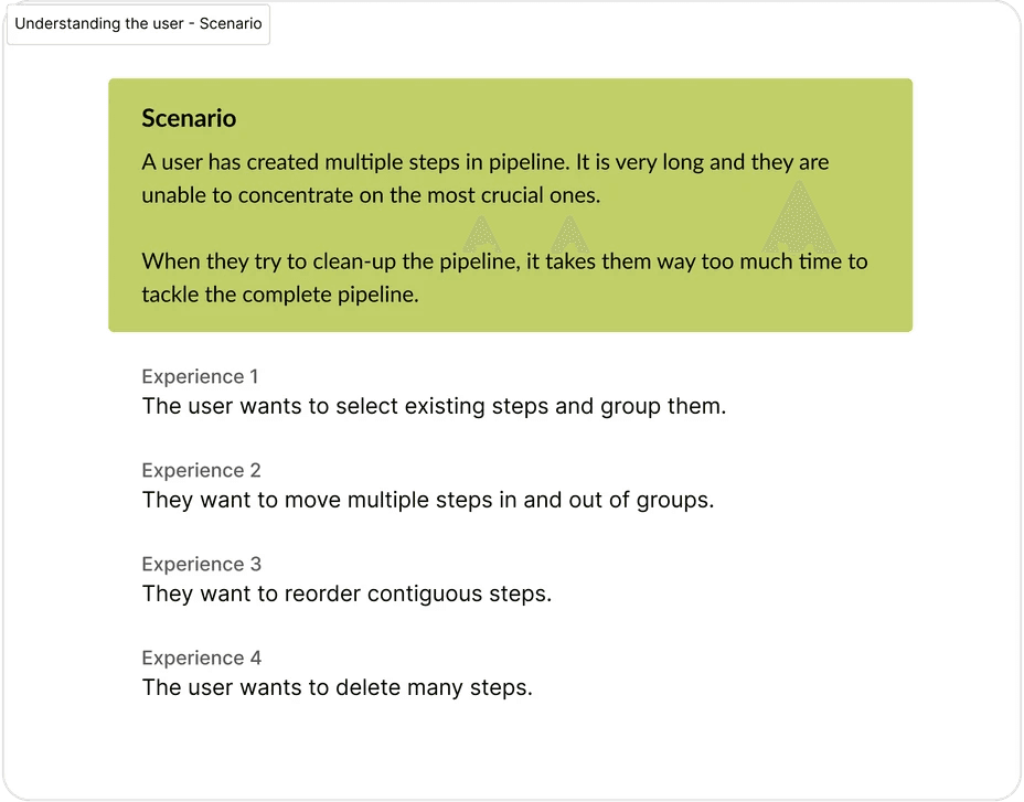
Solution
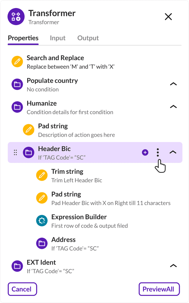
Organized pipelines with Groups and Sub-groups.
Along with new, empty groups, creating groups with existing steps is important. Users tend to come back in the end to clean-up pipelines before publishing.
Emphasizing the action to group when user selects multiple steps.
Solution
Reduced repetition with Group-level filters.
The user quickly adds the filter once on the group. If the user has 5 steps in the group, the filter would automatically apply to each step, increasing efficiency by 5x.
Pre-loading edit screen of the group reduces friction in adding filters.
Impact
Parity on 3 major features.
Grouping makes DQ almost ready to migrate our legacy app clients.
Higher market positioning.
Equal footing for pipeline management with a number of our competitors in the domain.
25% improvements in usability.
The UX enhancements shipped with groups led to a better and faster experience when tested with internal users.
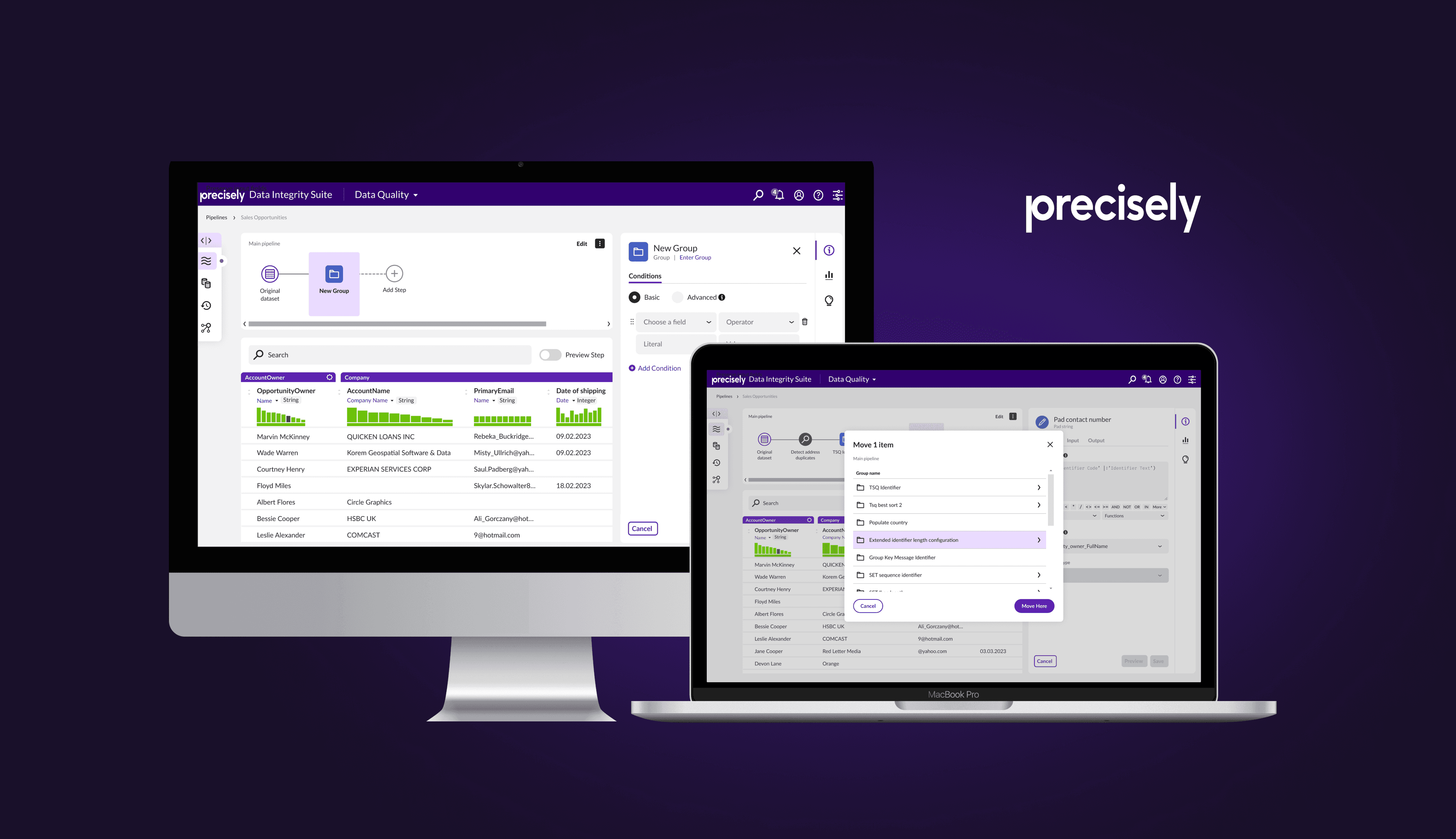
Move Steps
Control for users to move steps anywhere in the pipeline - prioritizing scalability.
If a step had to be moved down five levels, breadcrumbs or drag and drop was not going to cut it. I adopted an efficient hierarchy-focused approach that was familiar for users.
Exhaustive UX from Google Drive, Dropbox and One Drive were referenced.
Navigating Groups
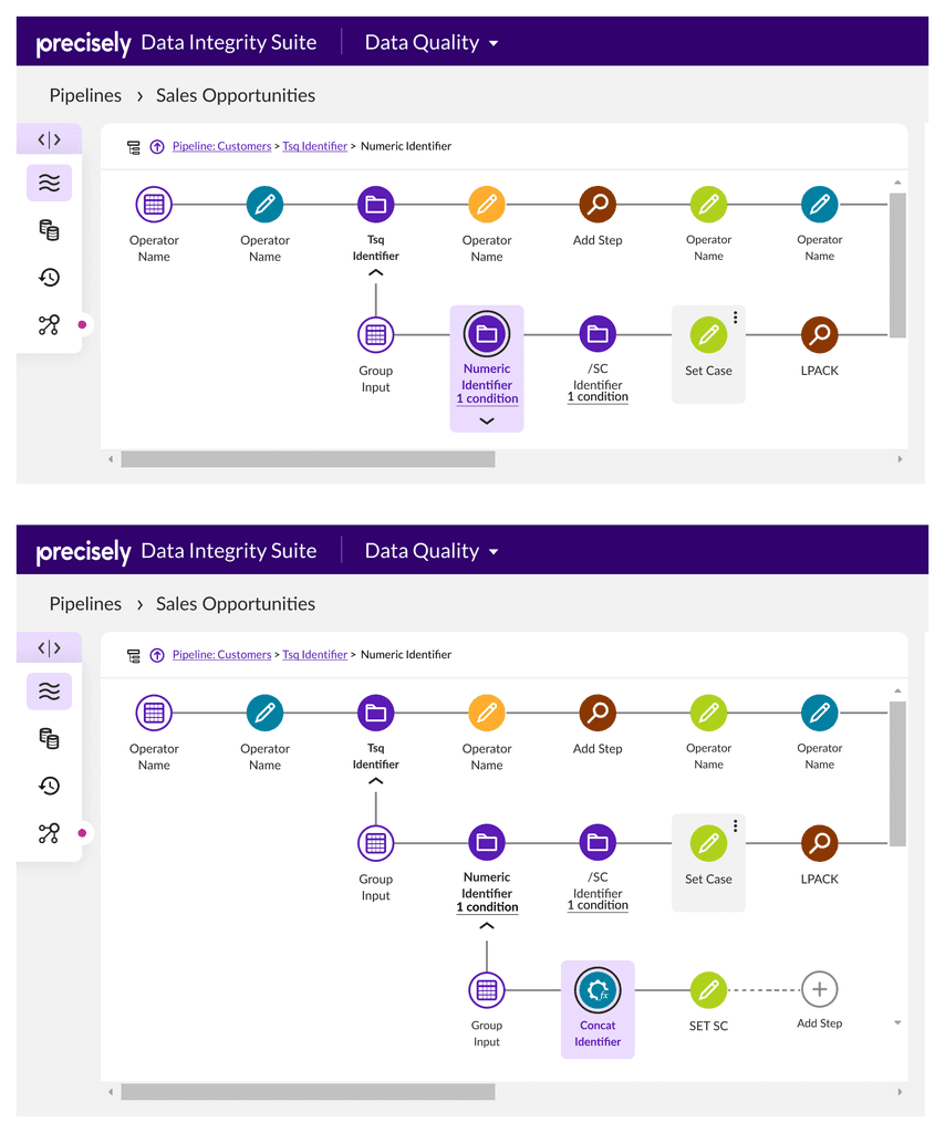
Refocusing on non-technical users with a drill down approach, building on exisiting single linear pipeline.
Option A - Drill down with only one flow visible at a time.
Option B - Parent flow and expanded group both visible for context.
Option C - Preview of selected group to view content before switching lanes.
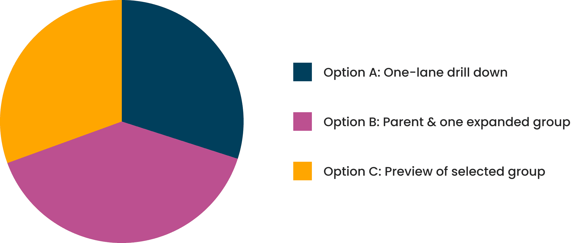
Feedback Survey
Narrowing down on a scalable option in spite of mixed results.
Results was spread almost evenly. Option B had a slight lead, but not significant enough to justify the higher cost of development needed for it.
Used best UX judgement with Option A, one-lane drill down.
This can be layered on with Option B or C based on user feedback. And it reduced dev cost for quick delivery.
Design Reflections
Identifying design requirements from feature requirements and seeking early feedback.
The feature requirements were simple. But a design breakdown to identify multi-selection as a dependency was crucial to implement major UX improvements.
Early feedback saves us time and pushes iterative development efforts. It's important to have strong design rationales to move forward amidst ambiguity.
Next case study

