Multi-Selection, Interactions, and Bulk Actions
Data Quality (DQ) users build complex pipelines with hundreds of steps. I revamped the pipeline builder to skyrocket efficiency with multi-selection and bulk actions. As a result, users see higher impact in lesser time, pushing our core business goal of feature parity.
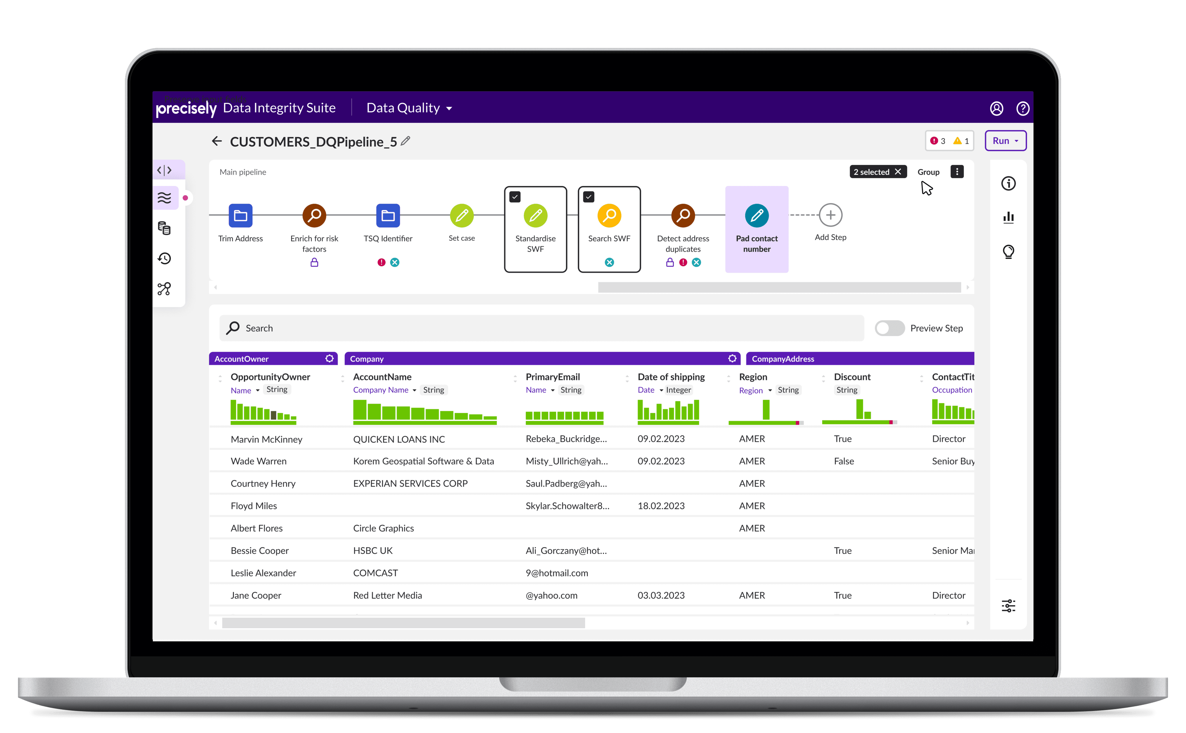
Problem
Managing complex pipelines is a big challenge.
Data Quality (DQ) lets users build pipelines to process data. But real world data is convoluted and needs a lot of processing. This can create extremely long pipelines.
One way to manage this is to group the steps (case study) or processes. But currently DQ doesn't allow actions on multiple steps. For a successful grouping experience, we need efficient multi-selection interactions.
Repetitive, similar steps add lots of scroll to the pipeline.
Exploration
Right now, DQ pipelines are inefficient.
After discussing with Subject Matter Experts (SMEs), I found:
1. Users tend to group existing steps.
2. Users often rearrange steps for pipeline clean-up.
Currently actions are taken on one step at a time. This creates inefficiency and hinders the tasks our users are trying to complete.
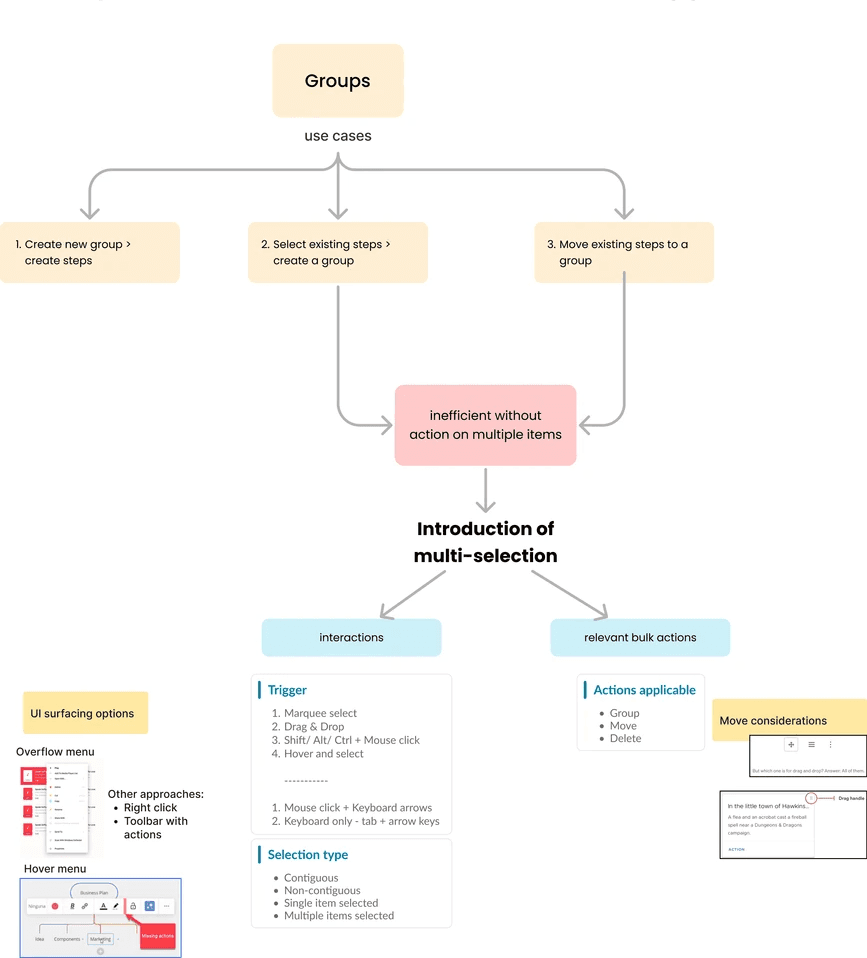
I identified multi-selection to be a highly impactful and feasible design opportunity.
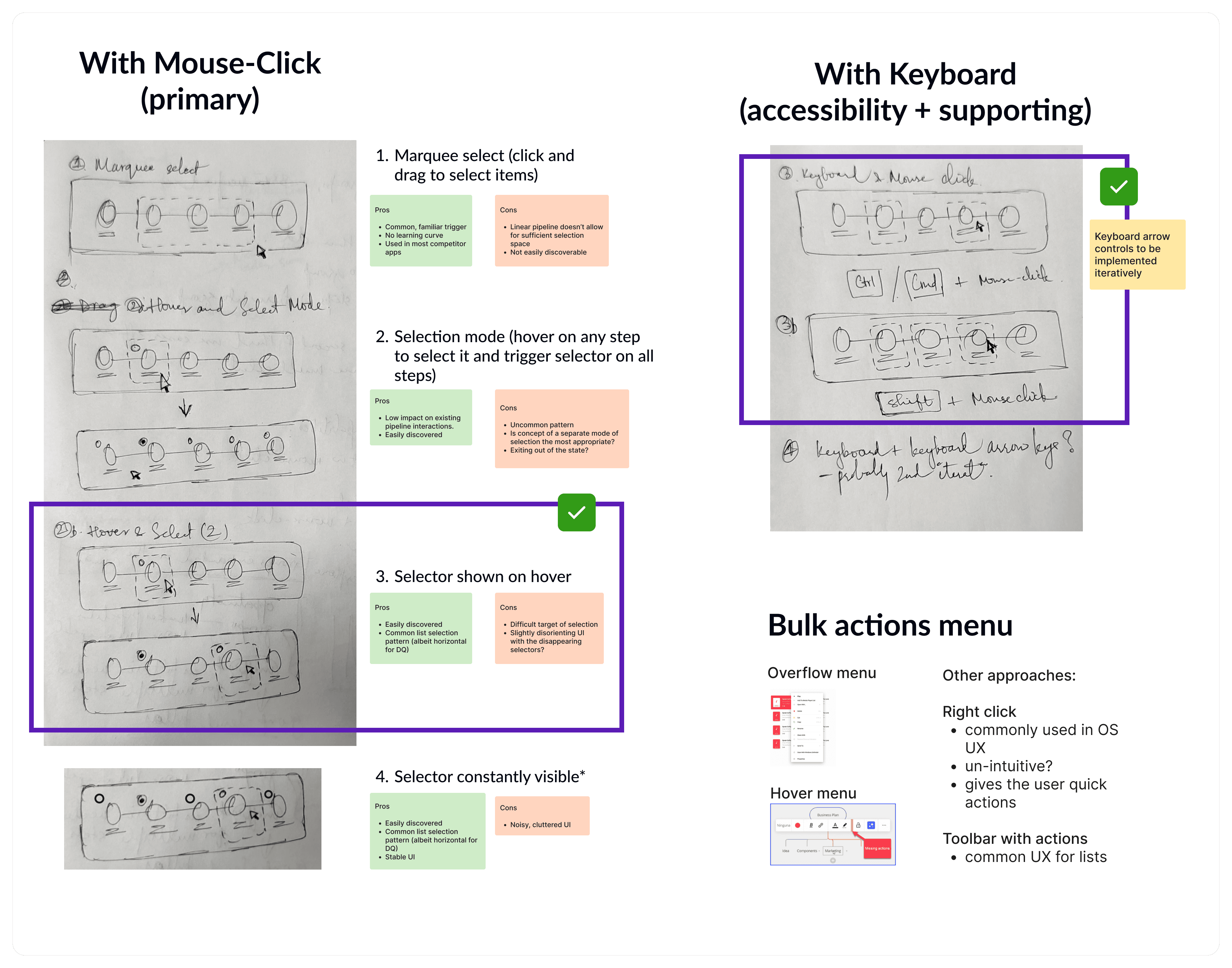
DQ makes smart use of HTML lists to support non-techies and simplifies the experience for power users. After internal testing and feasibility checks, I focused on checkboxes on steps as the main selector.
Solution
Empowering users with intuitive multi-selection and bulk actions.
Before
Long, unorganized pipelines. Cannot take actions on multiple steps.

After
User has control over organization of pipeline. Actions on multiple steps increase efficiency and productivity.

Solution
Improved layout of steps and designated area for bulk actions.
Before
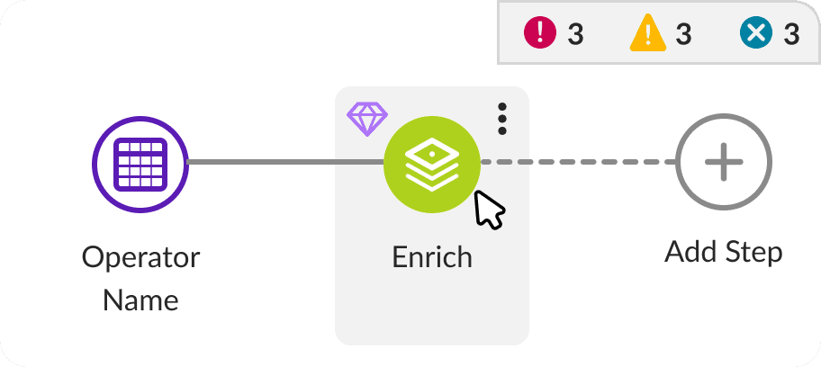
Poor scan, tiny click target.
Scattered details > scattered eye movement.
Bad clicks on action menu.
After
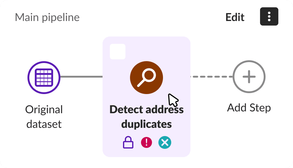
Linear scan, focused layout & actions.
Details within each step, top to bottom scan.
Actions menu in a fixed location.
Right-click menu introduced.
Impact
Multi-selection, bulk actions built the foundation for groups, increased efficiency.
Multi-selection received positive feedback from our SMEs and internal teams.
Additionally, multi-select created the opportunity to consolidate existing patterns across products, standardize it, and document it in the design system.
Additional Context
After securing stakeholder buy-in, I mapped the design areas.
1. Feasible Selector
Multi-selection has to be technically feasible without canvas controls.
2. Reduce Performance Issues
Loading preview for millions of records would hit the app performance.
3. Intuitive Reordering of Steps
Current lack of visual cues makes for a confusing reordering experience.
4. Design System Consistency
Need for interaction patterns that can be adopted across product teams.
Part 1: Feasible Selector
Efficient selection experience compatible with current UI implementation.
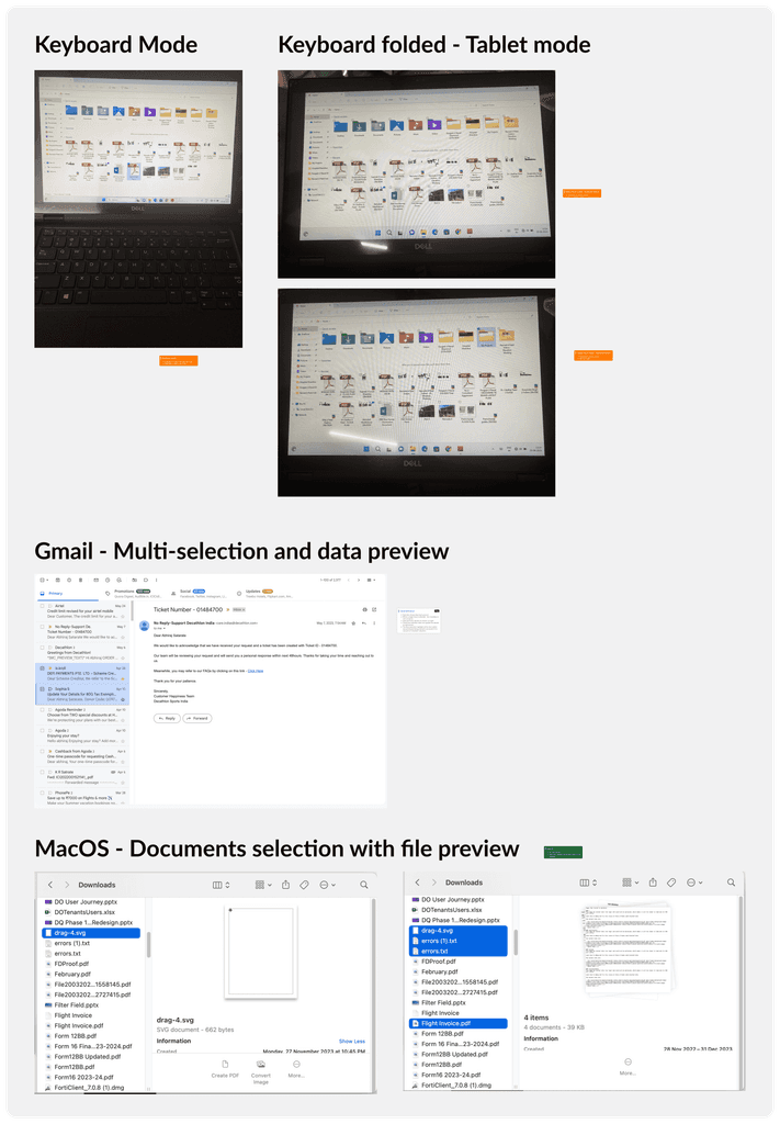
During informal internal testing, marquee selector was the top contender. But DQ pipelines don’t have canvas controls on UI. This limited the space for users to mark their selection.
Making the best use of our current list UI, I designed distinct interaction states with checkbox selectors.
Part 2: Reduce Performance Issues
Loading preview takes time. Detaching it from multi-selection created a glitch-free experience.
DQ shows a data preview for a selected step. My quick research on similar interactions shows:
Data preview either:
stays the same as the first selection or
gets updated to show multiple selections.
Bulk actions are updated with the selection.
Before
One, combined interaction that highlights step and updates preview.
After
Active step continues to show the preview below, not impacted during multi-selection.
Part 3: Intuitive Reordering of Steps
Visibility on drop targets increased accuracy and lowered user frustration.
With visual cues, users know exactly what is being dragged, and can be precise about where they want to drop it.
Before
Delayed reordering. No visual cues. Ambiguous drop area.
After
Consistent checked state and drop target cues. Ghost state for the item being reordered.
Part 4: Design System Consistency
Consolidating patterns to build standards and consistency with the Design System.
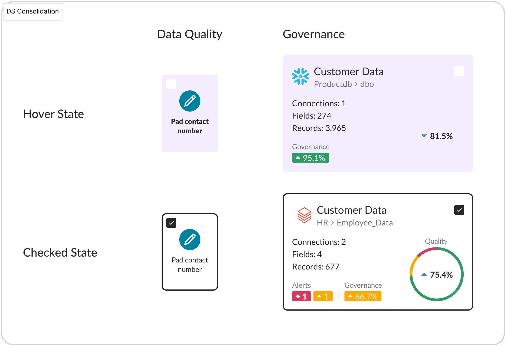
Collaborating with the Design System team, I led the efforts to identify multi-select instances, selection patterns, and visual states to tighten up the UI.
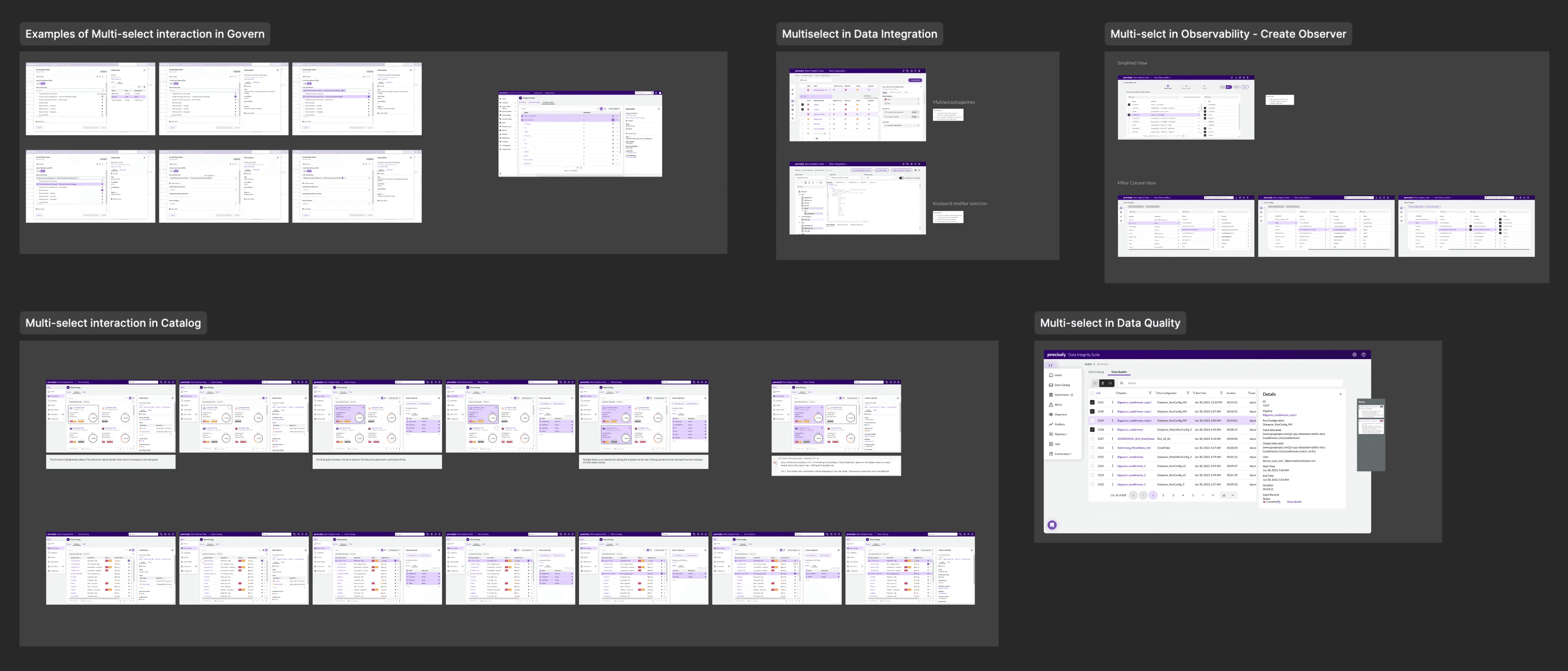
Collaborated with other designers to identify instances where multi-selection is being or will be used.
Example of reconciled selection patterns.
Next Steps
Defining and designing groups…
Multi-selection is the foundational feature and interaction pattern for using groups. After implementation, users can start creating groups and taking bulk actions across groups and sub-groups.
